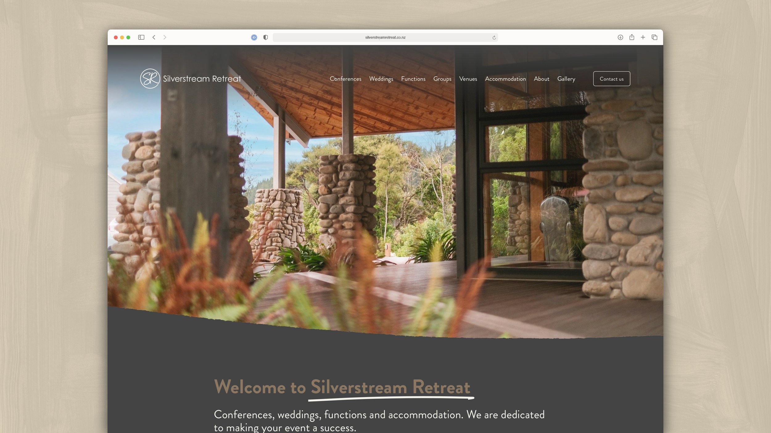
An immersive new website for Silverstream Retreat
Silverstream Retreat was in desperate need of updates to their website. The design of the previous website had a rigid and dated classical design that didn't accurately represent the high quality of the venue and its unique atmosphere.
With much of the details out of date, and being too busy to meet the content update requirements of their previous web company, they came to Tailwind for help.
This echoes a common story that we hear from clients:
The company that looks after our website is slow to respond and not very helpful when we need to request updates to our website. On top of that, we’re not sure what value we’re getting from the costly monthly maintenance fees. Can you help?
Yes we can! Not only did we make the updates to Silverstream Retreat’s website, we built them a whole new one that made everything better than they imagined. There are no monthly maintenance fees and it’s easy for them to update themselves — but we’re just a phone call away if help is ever needed.
We took the opportunity to expand their recent new logo into a fleshed-out visual identity, complete with colour palette, textures, visual and typographic treatments, and photography. And we dropped everything to get all of this done within a matter of weeks!
Take a look below.
We’re pleased to share that this project was selected to feature in the ‘Best Inspiring Web Designs’ category of DesignRush’s Best Designs Trends.
HOMEPAGE
BEFORE
AFTER
We really wanted to capture the atmosphere of Silverstream Retreat: warm architecture featuring rustic natural materials nestled in the hills above Te Awa Kairangi / Hutt River. We achieved this through the use of an appropriate colour palette, animated typography, textured brush-like edges, and contemporary layered design.
CONFERENCES PAGE
BEFORE
AFTER
The previous page made a feature of just one venue, diminishing the others, and had a lack of strong photography. We took the opportunity to treat each of the three flagship venues with big entries on the page, including a new custom site map that highlights each venue.
WEDDINGS PAGE
BEFORE
AFTER
When it comes to weddings, it is critical to capture the heart of your customer. We made great use of a range of fantastic photography supplied by past clients to showcase the unique atmosphere of a Silverstream Retreat wedding, and really show what each of the venues has to offer.
MENUS & PLANNERS
BEFORE
AFTER
Silverstream Retreat’s mix of PDF menus and planners were an inconsistent design that was based on the old brand design. So as part of the website upgrade we also took the opportunity to update these documents to better reflect the quality of the offering and make them easier for people to understand and use.
FUNCTIONS
BEFORE
AFTER
Functions are a key offering for Silverstream Retreat. Unfortunately the previous page was very light on content, missing out many important types of functions and thus not showing up in search results when they should.
We seriously bolstered the content on this page, with nice full-width imagery and pointing users to venues that are great for various types of events.
ACCOMMODATION
BEFORE
AFTER
Not enough people know that Silverstream Retreat offers the best accomodation in the Hutt Valley! Half of the complex is dedicated to accommodation, but looking at the old site you wouldn’t know it. There was very little detail and very few photos — much of them poor quality.
So we put a huge amount of work into this page to capture detailed information about each type of accommodation and take lots of good photos so that potential guests have everything they need to know that this is the perfect place to stay.
VENUES
The previous site lacked a page dedicated to the range of venues at Silverstream Retreat. There was some event-specific information on the Conferences and Weddings pages, but that was it.
We felt that it was hugely important to have a primary Venues page that could be linked to from anywhere else on the website. This allowed us to show as much detail as we wanted, including full image galleries (largely comprising photos we took), without having to bog down any of the event-specific pages.
This page is a real showcase for just how big Silverstream Retreat is and how much they have to offer!
SITE MAP
BEFORE
AFTER
The old site map was a flat rendering that dramatically undersold the quality of the venue and its lovely setting amongst the trees. We designed a new map, oriented the way that guests approach the Retreat, featuring a natural colour palette and texture, and plenty of trees to add a better sense of the place.
In addition to one overall site map, we created a series of individual maps that highlight ‘your venue’ or ‘your accommodation’ to provide to guests as a helpful way of highlighting the relevant details for their event or stay.
GROUPS
BEFORE
AFTER
This was another area of the old site that was light on detail. So we fleshed this out and created a stronger focus on each event type. We also took the same approach as the Accommodation page to highlight each of the group accommodation types in great detail, with new photos across the board.
ABOUT
BEFORE
AFTER
The About page of a website is often overlooked. It’s where customers go to make sure they’re putting their trust in a business that is aligned with their needs and values. So we made sure to take a fantastic hero photo — welcoming entry through the reception doors — followed through with immersive imagery and information about Silverstream Retreat and its history.
OPTIMISED FOR MOBILE DEVICES AND DISPLAYS
Detailed custom website designs such as this require a big focus on how it looks and works in all devices, including mobile and tablet (portrait and landscape).
Phone
iPad


