A transformative brand refresh for Above Focus Roofing
Above Focus is a roofing company based in Wellington that was in its first year of business when they approached us for a website design. We immediately evaluated their brand as undervaluing the quality of their workmanship and recommended that a website would perform much better with a brand refresh behind it.
So our task became: capture what makes Above Focus great, craft a memorable brand that tells this story, and apply this effectively across all of their channels and collateral.
See below to find out how we transformed a business from looking like ‘just another roofer in a van’ into a memorable top-shelf team of experts. Nothing about the actual business changed — they were always great! — now the world knows it from first impression.
Learn and Define
We established our clients’ needs through a detailed questionnaire and face-to-face meetings. This enables us to understand the company’s core ethos and key differentiators. It can be hard to distinguish yourself among other small businesses in your industry, but we believe that by establishing a clear brand identity can set you apart from the rest.
As a result of this process we defined the brand criteria as:
Highly experienced and accredited
Trustworthy
Customer-focused
Attention to detail and consistent quality workmanship
Incorporates learnings from competitor research
Competitor research
The first step of our process was to research direct competitors to our client’s business and assess their branding strategies. We found that many logos were similar designs that featured rooftop outlines, outdated typography and generally cluttered compositions. We also noted that many companies use the colours red and yellow logo for their brands.
We assessed the following competitor brands (click to view)
LEARNINGS
There are few high quality and memorable brands in this space. The best designs are Aquaheat and Newton Roofing — sharp and clean. Paul Milne is seen as an industry leader but the logo itself has some technical problems (‘P’ too far from the ‘a’, ‘M’ too close to the ‘I’) and the tagline is too busy. But the brand itself has a reasonably light and approachable feel to it which appeals to the male/female customers equally, whereas most of the other brands are very masculine.
To differentiate Above Focus, we needed to avoid:
Relying on an obvious roof-line as core imagery, they are overused in the industry (and others, such as construction/building companies)
Red and yellow as they are commonly-used colours
Using orange to avoid conflict with Paul Milne
Making the logo too serious/masculine
Adding too much text to the logo (e.g. Paul Milne, RSL, Edwards & Hardy)
Having too much detail (e.g, RSL, Hornet)
Using an all-uppercase font as the vast majority of competitors do this
Instead, we would consider on creating a brand with:
Colours that are distinct from competitors
Lowercase wordmark, particularly as it feels more customer-friendly
Nice clean and simple design
An approach a memorable wordmark (lettering) that can stand alone from the logo mark (roof)
There are no brands that employ serif-style fonts, consider using this as a differentiator
Brainstorming and sketching
Sketches
Sketches
Selected
We explored the use of geometric logos and ways to incorporate the ‘A’ for Above Focus. Two ideas were selected to take into developed designs. One, a monogram concept that uses negative space to create an ‘A’ for Above. The other, a geometric pattern contained within a circular shape we thought was a great way to communicate the idea of focus. It also helps to soften the rigid, ‘masculine’ lines of a roof which we learned to avoid.
Digital experimentation and refinement
We worked towards a precise yet friendly design with bold linework to favour scalability and simplicity. High contrasting colours such as black, white and teal are attention-capturing and are effective at a number of different scales and formats. The thick linework also evokes a targeted focus on a specific area of a roof from above.
Next, we refined the geometry further and started tweaking the colour palette. Then we explored suitable font options and how a tagline could work in combination with the wordmark. The aim was to land on typography that has a contemporary geometric feel to pair well with the brand mark. It became clear that a perfectly circular ‘o’ was mandatory for this to work well.
Final brand presentation
DESIGN RATIONALE
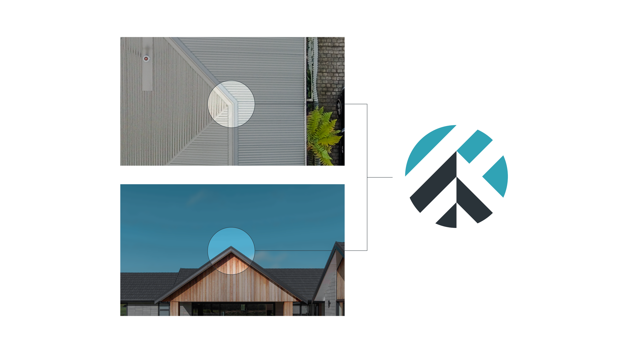
The linework is crafted to reveal an ‘A’ for ‘Above’, appearing as the flashed peak of a gable roof as viewed from the ground, emphasised with the use of the blue brand colour as a sky above.
The linework also looks like the intersecting lines of a roof junction as viewed from above, further emphasising ‘Above’ in the name.
The circular shape conveys the sense of focus on the details.
The large stripes appear to be a close-up level of focus, like a magnifying glass or telescope.
The linework is clearly inspired by and depicts rooflines.
Perfect geometry reinforces your attention- to-detail and accurate workmanship.
Alternating lines create a sense of light and make the logo mark striking and memorable.
The word ‘roofing’ is not necessary to be a permanent part of the logo as this can be communicated with the supporting taglines (as per cover page).
Logo variations
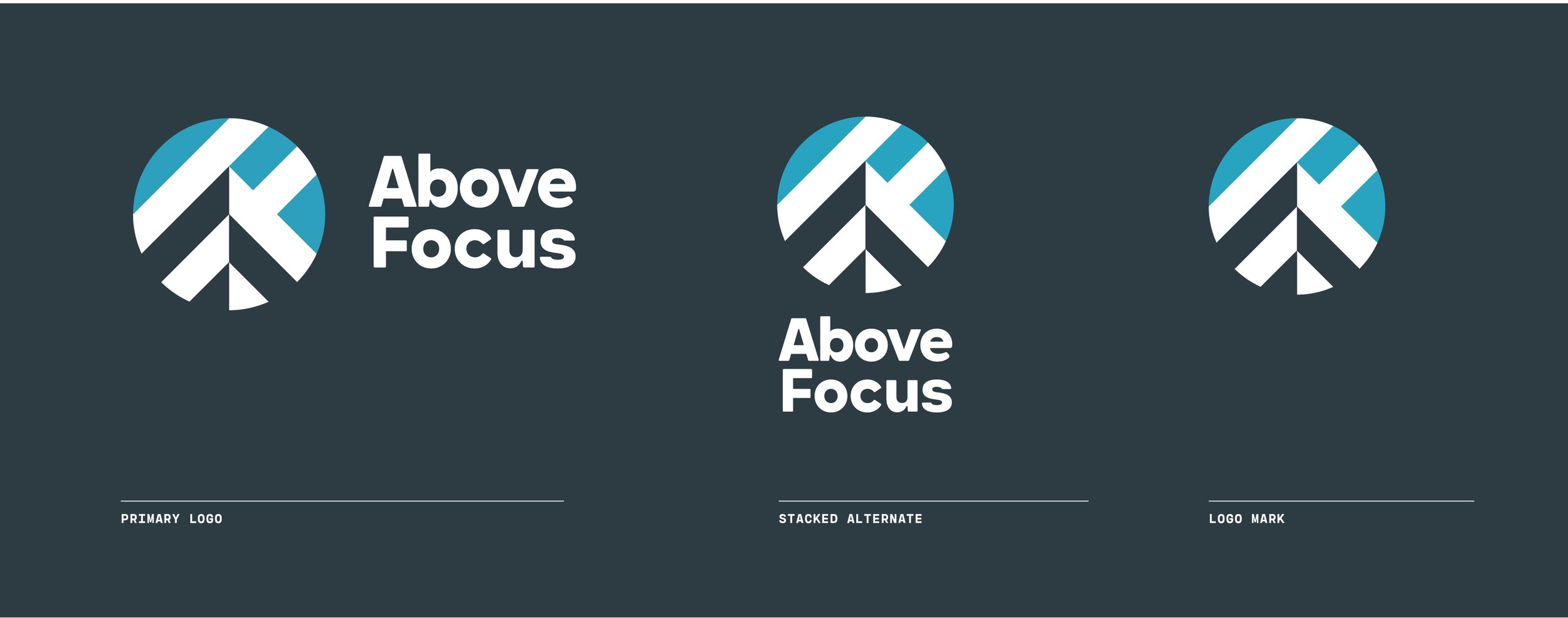
We consider it mandatory with every brand to create at least two variations: landscape/horizontal and portrait/stacked in full, reversed/inverted, and single colours. This is so that our customers are never faced with a situation in which their brand doesn’t look its best in a given situation.
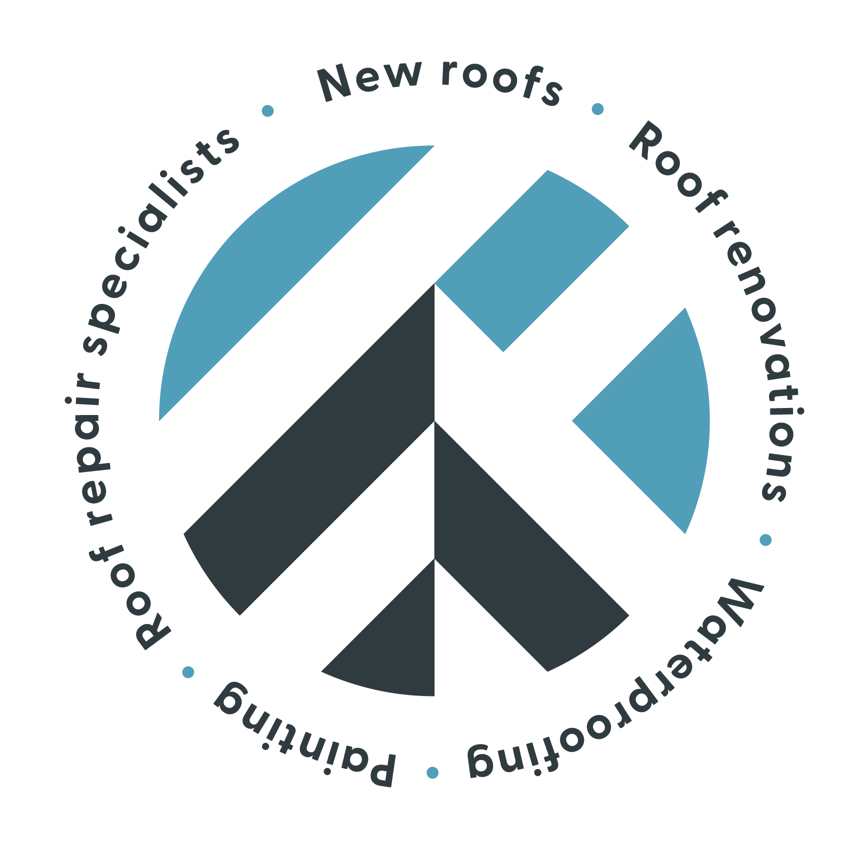
We expanded the Above Focus visual identity with some secondary elements such as patterns and a badge design. These elements add to the toolbox of the brand and further help solidify the brand across all mediums and make it more memorable.
Brand stationery
Business cards
Business cards
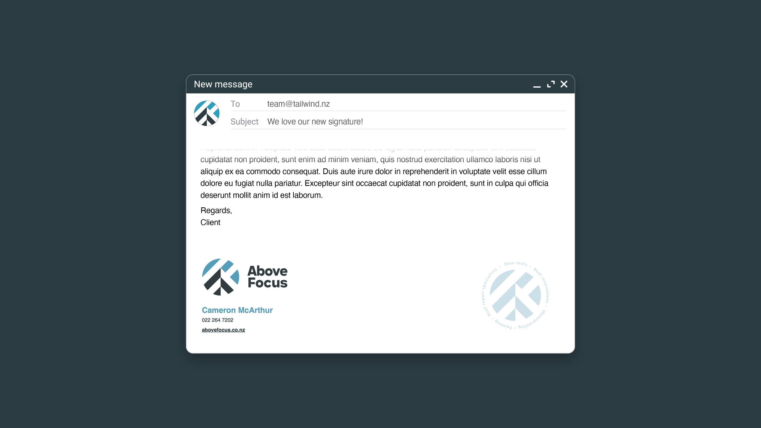
Email signature
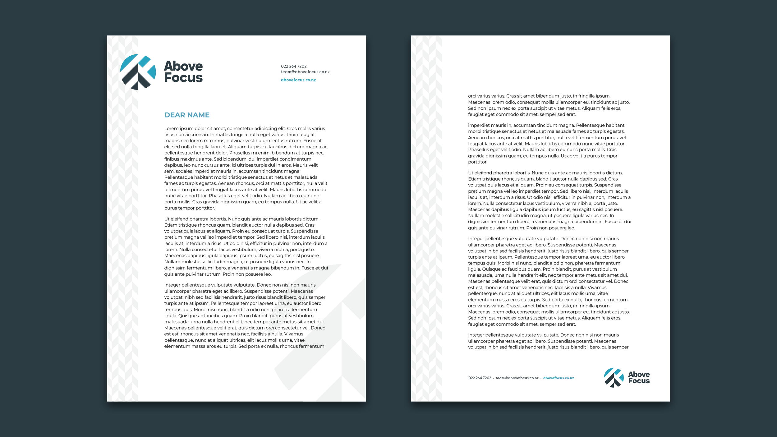
Letterhead (print and digital)
The Above Focus business cards were designed with a specialty digital varnish in mind that accentuates the pattern and gives a highly professional look. We worked with our print partner to make sure the finishing was perfect — critical for representing a business that focuses on the details.
A well-designed email signature and letterhead is an important way to reinforce the credibility and professionalism of a business. All of the written communications from Above Focus look as good as the biggest corporate company and allows them to easily stand out from their competitors.
Social and Google Business
Instagram and Facebook setup
Above Focus wanted us to go the extra mile in setting up their new social media channels. We set up Instagram with some custom icons to represent their key services (which we since incorporated into their apparel designs) and loaded Facebook with full detail about all their services.
The importance of this means that any customers who encounter Above Focus first in a social media setting will get a fantastic first impression that doesn’t leave anything to chance.
Google Business Profile
As a service business, Above Focus relies heavily on local Google search results that appear in the sidebar of a web search or in Google Maps. A good Google Business Profile is key to convert customers who are searching for local roofing company. We set up the Above Focus profile with strong branding, clear information, and engaging imagery.
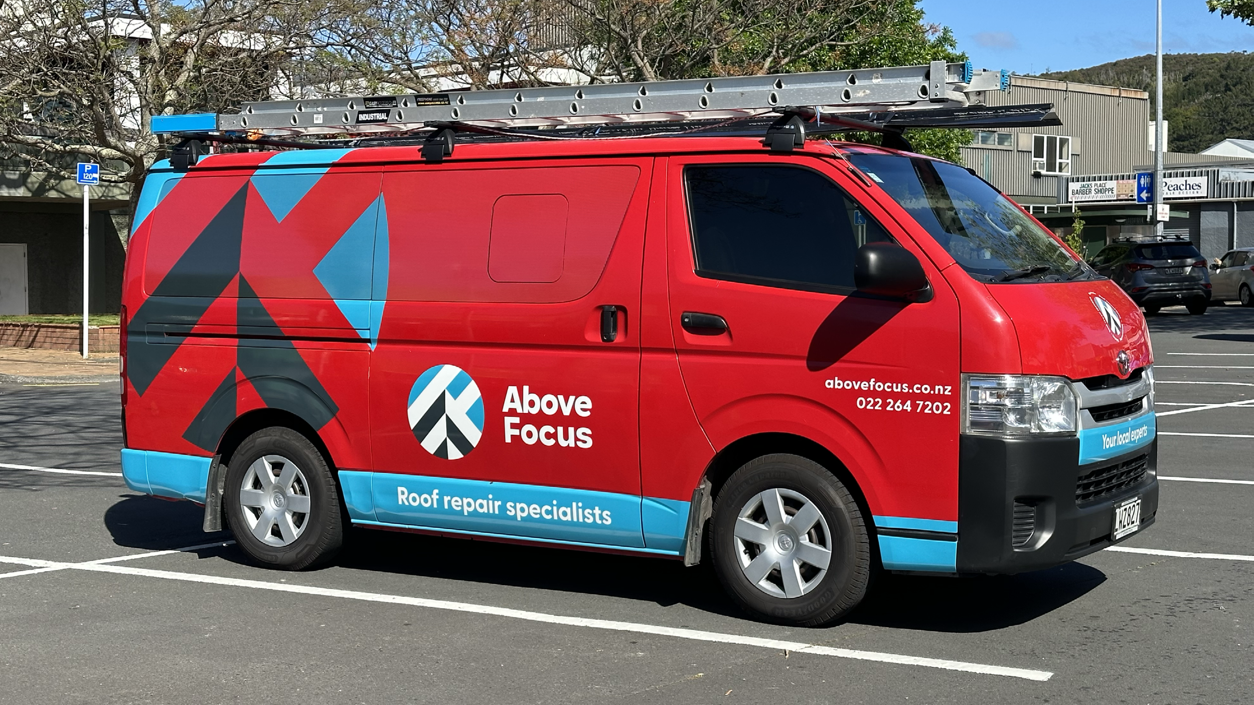
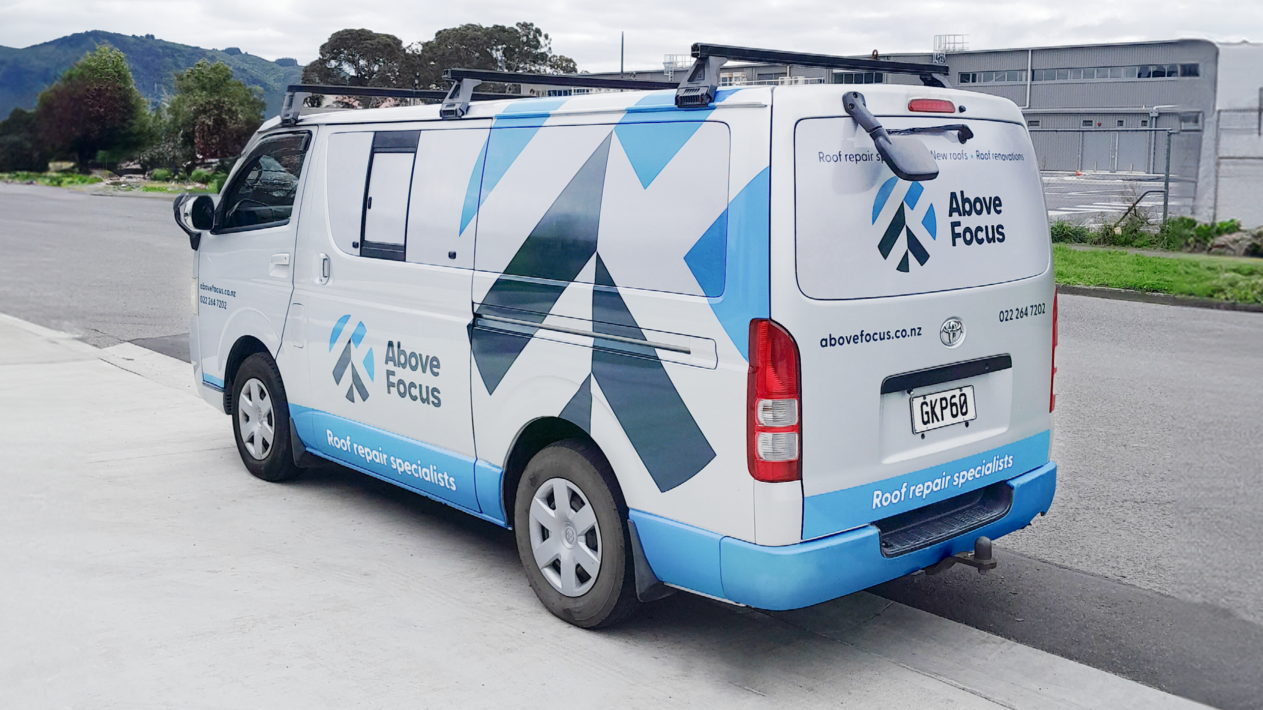
Vehicle graphics
Striking vehicle graphics is one of the best investments a business can make — especially one with large vehicles that are on the road often. We had to create a design that was cost-effective while providing big impact. The design needed to work well on an existing red van while being consistent with silver and white vans also in the fleet.
Apparel
Above Focus wanted us to be creative with their staff apparel instead of just slapping on a logo. We’ve come up with a few options for the client to consider. This is a work in progress.
Website Design
An online presence can make a huge difference to customers’ perception of your brand — having your own website is a cornerstone to engage and inform potential new customers and persuade them that your services are the best they can get.
Above Focus needed a number of key functions on their website:
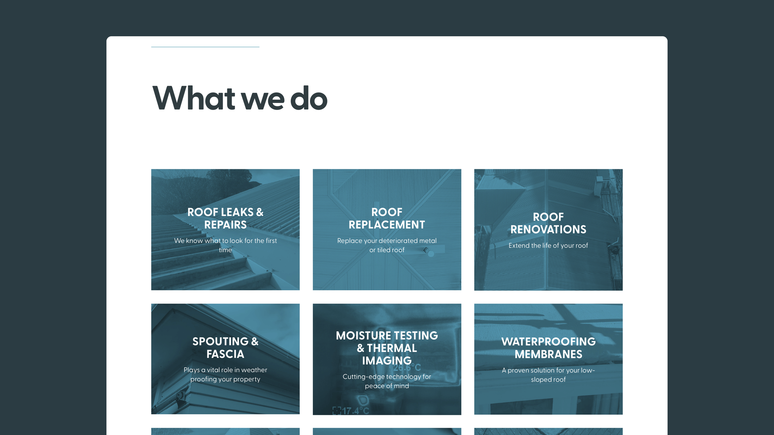
Inform customers about the wide range of services that Above Focus offers beyond just roof repairs
Highlight their qualifications, certifications and customer testimonials to gain trust in potential customers
Provide an overview of the products that Above Focus recommends and uses, leaning on the credibility of those brands
Display their latest projects in a ‘blog’-like format, to showcase real instances where they provided quality workmanship with great results
HOMEPAGE
A good homepage showcases the brand well, clearly communicates to a visitor who you are, what you do, and why they should care. It briefly summarises everything the company has to offer and makes it easy to get to the information on offer.
SERVICES PAGES
It is best for search engine performance that each product or service that a company offers gets its own page. Above Focus features nine Service pages to cover each adequately. For consistency, each page features a hero image with title, introduction, explanation, ‘before and after’ comparisons, and a link to view related projects in the blog section.
PRODUCTS PAGE
It was important to our client that their partnering suppliers’ products were showcased in a clear way, to enable customers to navigate their options all in one place and ultimately make an informed decision about the best option for their home. For this reason we developed a user-friendly ‘tab’ system with thumbnails and specifics for each product variant.
PROJECTS BLOG
Above Focus had already demonstrated a commitment to regularly sharing their projects on third party sites like Builder’s Crack. We took this momentum and guided it onto their new website. Regular detailed content is critical to share the depth of their expertise and improve search engine performance.
This projects page is easy for the client to post to themselves and incorporates a tag category system which allows customers to view the projects relevant to their needs and is how we link to relevant projects from the various Services pages.

