A Friday Facelift
Friday Homes becomes FH Group Developments and Friday Homes Construction
The Tailwind team dedicated much of 2022 to transforming well-known local building company Friday Homes into a fully-fledged property development company. Mike Friday of Friday Homes came to Tailwind with a goal — rebrand the business as “FH Group” and build a sophisticated and flexible new visual identity across every facet of the business: web, digital, social, print, signage, vehicles, and more. We were able to consolidate and streamline all their marketing needs. It was a huge effort that drew on all of our collective experience. We’re stoked with the results, and so are they! Let’s show you.
Before and After
“We engaged the Tailwind team to create branding, a website, and all associated marketing collateral for our development company FH Group.
From the get-go, the team were forthcoming with great ideas to set us apart from others. Through their innovative approach we have successfully launched and had fantastic feedback. With the success of FH Group, we also engaged Tailwind to rebrand our construction brand Friday Homes. The two are now cohesive and brands we are incredibly proud of.”
— FH Group
Logo Design & Branding
FH Group wanted to establish themselves at the top end of the market in terms of quality and presentation, appealing to customers looking for generously-sized residential dwellings with modern features and quality construction.
It was important that the FH Group brand not be confused with the Friday Homes brand as this was to remain as the building provider for FH Group. However, the client wanted to retain a strong connection to the original brand. It was critical that the brand be distinctive and memorable and could stand on its own yet retain some semblance to Friday Homes.
Our solution was a modern and formal monogram design that gives a sense of authenticity and credibility. It evokes a floor plan as viewed from above with cutaways at the intersections of the F and H to give the illusion of shadow and depth. The cutaways add a subtle nod to the original Friday Homes logo by appearing as a pair of rooflines.
Flexibility of use was a key consideration in the building of the logo and brand. The monogram stands on its own as a strong mark, and it expands to envelope the wordmark in landscape form. We selected a brand font which has sharp, wide sans-serif with an engraved feel.
We retained the Friday Homes teal because it’s such a distinctive colour in the market. Adding navy blue sets the teal off, giving it a dimension of sophistication. The addition of the 'Developments' tagline solidifies the company’s purpose.
Landscape logo
Stacked Logo
Monogram — Social icon
Friday Homes Construction — Sub-brand
Brand Stationery
Business Cards
Check out the beautiful sheen on this card from the gloss overprint (Spot UV). It’s a subtle detail (we’re good at those) that adds sophistication and cool. This effect was replicated on the vehicle signage designs later in the project.
Letterheads
We’ve used pattern here to add a formal tone to the letter template. The single-line footer (which incorporates the monogram) functions equally well on the cover page and alone. The template is provided as a Word and Google Docs format for customer to use in-house to maintain the brand presentation at all times.
Email Signatures
We consider a well-designed email signature an essential component of the brand package for any brand. Here you can see how well the logos partner with their monograms to create an engaging email message. Email signature designs are restricted by limitations in email standards and lack of font options, but we always make the best of it.
Part of this project was working with a company-wide implementation of a system that automatically applies signatures to all outgoing mail so that the company maintains a professional image no matter who is sending the email and what device they are using.
Website Design
FH Group wanted to bring function and form together to create an excellent experience for their customers. Not only were we able to design a site that advertises properties for sale, but one where customers can specify the details of their purchase down to what sink mixer they want.
A wealth of information is contained on the FH Group site and it was imperative that customers find what they want and quickly. An emphasis on large images and well-considered navigation lends itself to an engaging and enjoyable online experience.
Collection/Index Pages
FH Group’s developments are grouped into three categories: Coming Soon, Selling Now, and Completed. We created an index page template for each that is engaging mix of hero tiles that link to each specific development.
Development Landing Pages
Each property development has a detailed landing page which all marketing is directed to. The top section features full-width imagery imbued with the brand pattern.
This is followed by a top section that features a detailed summary of the attributes of the development. This includes a list of short links to each Lot with tags for ‘sold’, ‘under offer’, and ‘move-in’ ready. A nicely-designed price list is linked here, in addition to the fantastic digital edition of the sales booklet. Finally, the project completion estimate and a link to a dedicated page that tracks the progress of the development.
About the Area
A valuable addition to the website, as well as the print/digital sales booklets, is the ‘About the Area’ section. We felt it critical to sell the lifestyle of the neighbourhood and city of the development to prospective buyers. Tailwind conceived of the idea and set about researching and sourcing information and photos to best represent each suburb.
Property Section
Each property is presented with the same consistent building blocks across all mediums. We make sure to clean and label all floor plans and carefully scale them consistently throughout the page for accurate representation and comparison. Helpful links make it easy for visitors to submit an enquiry, see construction progress, view detailed plans for the property, and even download complete legal sales documentation to purchase the property.
Digital Resources
Detailed Plans Document
These comprehensive documents are designed to capture the architectural information about a property and present them in an attractive layout consistent with the rest of the marketing material. These are documents that are often overlooked from a brand presentation perspective but they benefit from improved legibility though good design.
Sales Documents
FH Group wanted a customer to be able to download a complete set of documentation required to purchase any available property. We devised a system that compiles multiple documents that form the Sales and Purchase Agreements. Tailwind are proficient at formulating solutions to complex document problems and this is a prime example!
Customers can download the document and digitally complete the full Sales & Purchase Agreement, all attached forms, and even make specification and upgrade selections and see the total price automatically update on the first page of the agreement.
Buyers Guide
We were tasked with pulling together a useful resource for first home buyers to show that FH Group is a great company from which to buy your first home. It draws on information from multiple banking and lending sources to help customers navigate this aspect of home-buying.
Price List
Even the humble table can undergo a transformation where hard-to-decipher or buried information can be arranged in a pleasing and functional way. These price lists are designed to look fantastic if emailed or printed and attached to other sales material, and scale from small to large developments.
Specifications Document and Webpage
Would you like black handles with that? This document could well be the pièce de résistance of the FH Group collateral. A complex document including product details, an interactive checklist of upgrades and corresponding costs, and interior mood boards presented with clarity and precision. A prime example of taking multiple existing documents, refining them, improving them and compiling them into one easy-to-navigate document.
Fit & Finish
The first part of the document is a magazine-style layout that takes customers through all of the fit and finish details of an FH Group home. This content was also reproduced in abbreviated form on the website.
Digital Booklet
Web Summary
Spec & Upgrade Checklist
FH Group wanted a document that listed every specification and upgrade so that it could function as a checklist for customers to select their preferences and produce a total cost. It was paramount that this document be clear and easy-to-use because it is one of the mandatory requirements for purchasing a property. It was a complex and rigorous project to collate and reorganise all of this technical information to achieve this goal, culminating in a multi-page PDF with check boxes that automatically calculates a sum total.
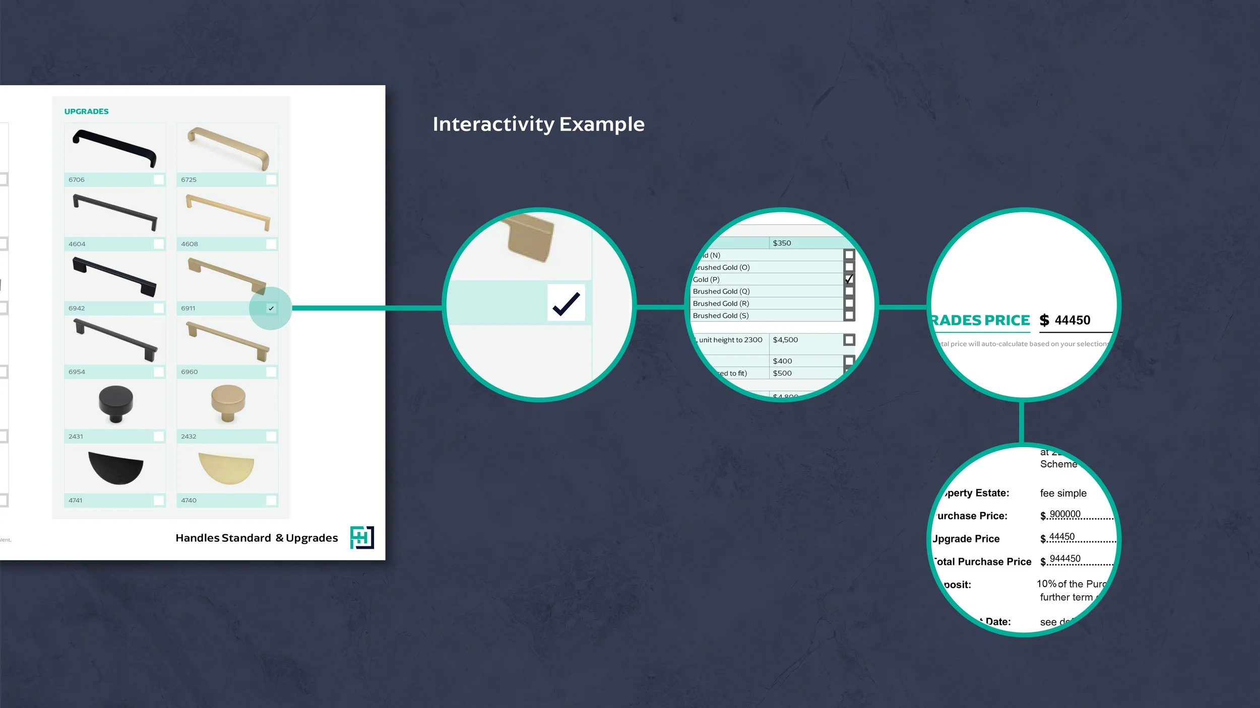
Interactivity example
Here’s an example of how a selection made in the visual guide synchronises with the checklist, updates the total upgrades price, and updates the sums in the Sale & Purchase Agreement.
Moodboards
Previously Friday Homes only had physical mood boards in their showhome, so our goal was to recreate the physical mood board as best we can in digital form in order for customers to make their selection. Compiling accurate colour swatches and samples was a big part of this project.
Digital Booklet
Webpage
Visual Guide
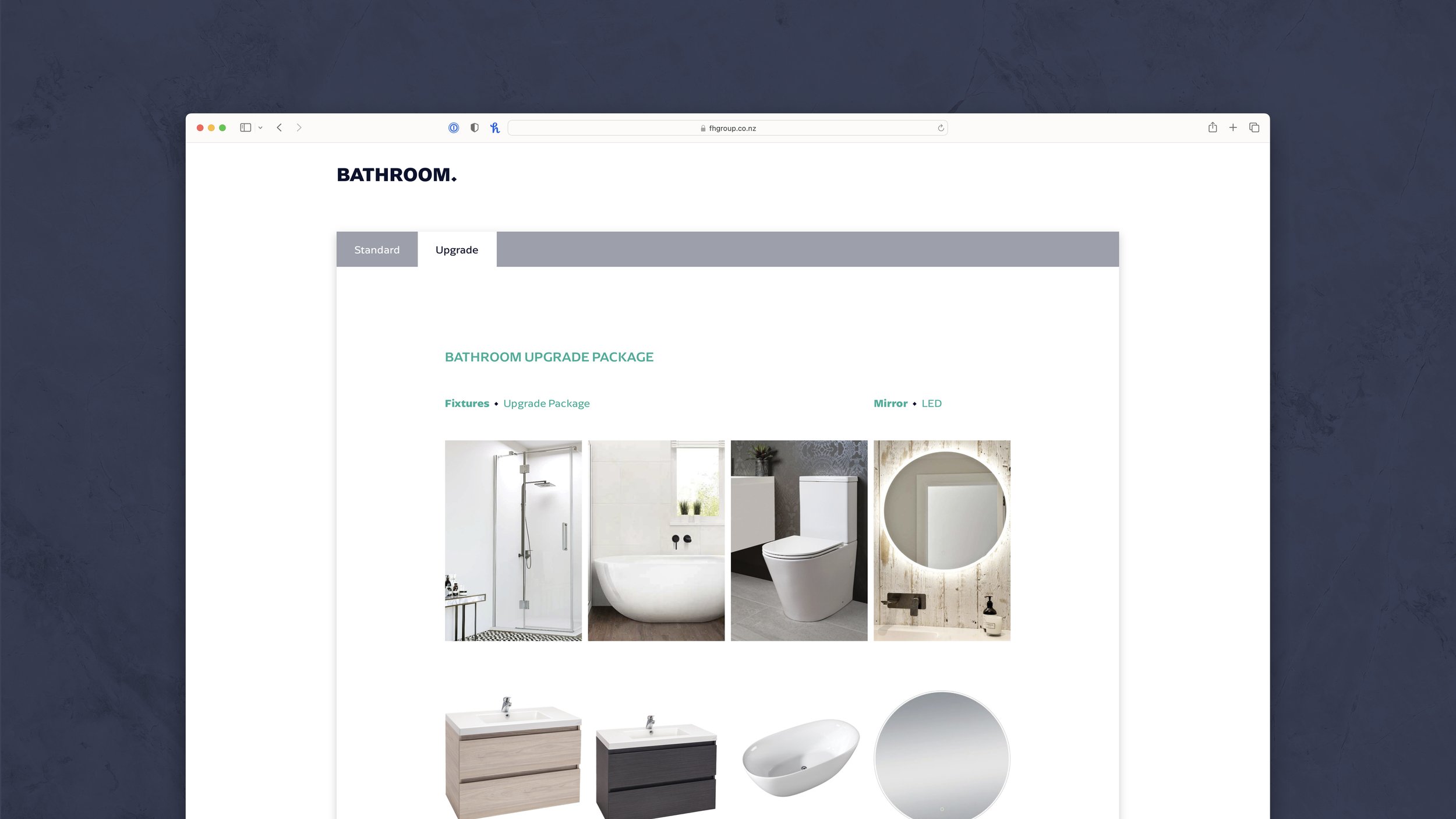
As part of the overall document we designed a visual guide to accompany the detailed checklist table. Often it’s easier to make decisions visually. Customers can easily see and compare the standard spec to the available upgrades. Any selections made here sync with the checklist and auto-update the total price.
This section is reproduced in full on the website, complete with tabbed sections to easily compare standard and upgrade spec.
Digital booklet
Webpage
Sales Booklets
Visitors to showhomes and open homes are presented with comprehensive booklets that detail each property included in the specified development. They are an excellent visual representation using high-resolution renders and modern layouts to form a highly-informative reference document. We love to use this landscape format for property booklets because it showcases the imagery so well.
We built the template for these documents in a way that a single booklet design can produce the print artwork for the physical booklets as well as the digital version for viewing on the web.
Print booklets
Digital booklets
Trade Me & Social Media
In the property industry, Trade Me and Social Media are critical pieces that almost every customer engages with. So we put a big emphasis on designing stunning templates for Trade Me and Social Media to best showcase FH Group’s properties.
Trade Me Listings
Trade Me slides are a surprisingly challenging format as the slides crop differently depending on whether the images are in a carousel, full screen, thumbnails, and viewed on the web vs in app. So we design our Trade Me slide template such that it looks as good as possible in all cases.
Page Setup and Profile Imagery
Social Tile Templates
One of the key goals for the FH Group brand was to create something that is distractive and attention-grabbing when scrolling through a social feed. The combination of font, colour, and pattern, as well as the distinctive monogram logo, are clear to see in these social tile template examples below.
Signage
Selling homes demands a strong visual presence to project a sense of authority and expertise to the market. Like social media imagery, consistent deployment of the brand elements creates a through-line that customers begin to notice and remember as they travel throughout the region.
Showhome Signage
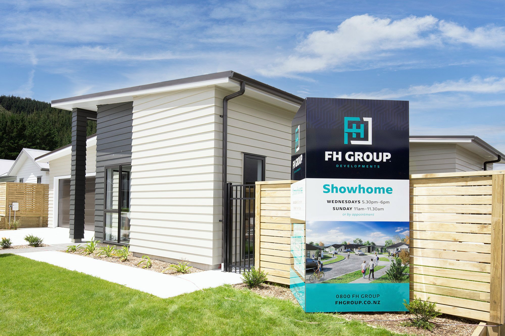
Exterior 3D tri-sign and flags
Interior showcase walls
A key feature of the FH Group showhome and offices are these showcase walls with brochure holders. We designed these to hold the sales brochures and show off the wide range of developments in progress and coming soon. The signboard artwork is reproduced at smaller size adjacent to each brochure holder and custom ‘sold’ stickers are applied to keep track of the property sales.
Development Site Signs
Coming Soon Sign
As soon as a property has been earmarked for a new development, FH Group puts up one of these signs. They’re loud and proud, and a stunning encapsulation of the branding. Because council rules dictate that long-term temporary signage must be specific to the property, we designed these signs to be reusable with a generic design that accommodates a removable decal in the corner for the property address.
Available Now Sign
As soon as a development is brought to market the Coming Soon sign is replaced with one of these. We designed a fantastic flexible template that presents key features of any development including a site map with custom sold stickers to track availability. The QR code takes visitors straight to the website landing page.
For Sale Signs
Vehicle Graphics
The FH Group pattern works incredibly well in matt black vinyl against the gloss black paintwork to produce a highly-refined look.
That’s a wrap! For now.
We continue to support FH Group with marketing pack design, social media graphics, and new marketing design. At Tailwind we love to be able to take care of everything right from the creation of a stunning brand and its applications across every facet of a business.
Talk to us today to see how we can make such an impact on your business.


