Transport Trailers Brand Refresh
When many small details combine to make a big difference.
Just as Transport Trailers has high standards for accuracy and quality with their product; so too should their logo.
Transport Trailers is a longtime partner of Tailwind and an iconic brand in the New Zealand transport industry that has been around for nearly 70 years. Their logo had remained unchanged for many years and is a source of immense pride and the company is very protective of it. That is why, when it came time to give the whole Transport Trailers brand a much-needed upgrade, we treated their logo with great care.
This case study is a great illustration of how details matter. We identified 13 issues with the craftsmanship of their logo. Details most people wouldn’t notice but, once corrected, collectively make a big difference to result in a logo that looks cleaner, tighter, and more modern, while remaining true to its former self.
Old Logo
Here’s a challenge for you. Before scrolling down further, see if you can find all 13 things that are wrong with this logo.

Here’s what we found:
New Logo
You can see how, with everything corrected, the result is a much tighter and more refined logo. It’s amazing the total impact of such small changes.

Here’s what we corrected:
Compare the two by flipping between them:
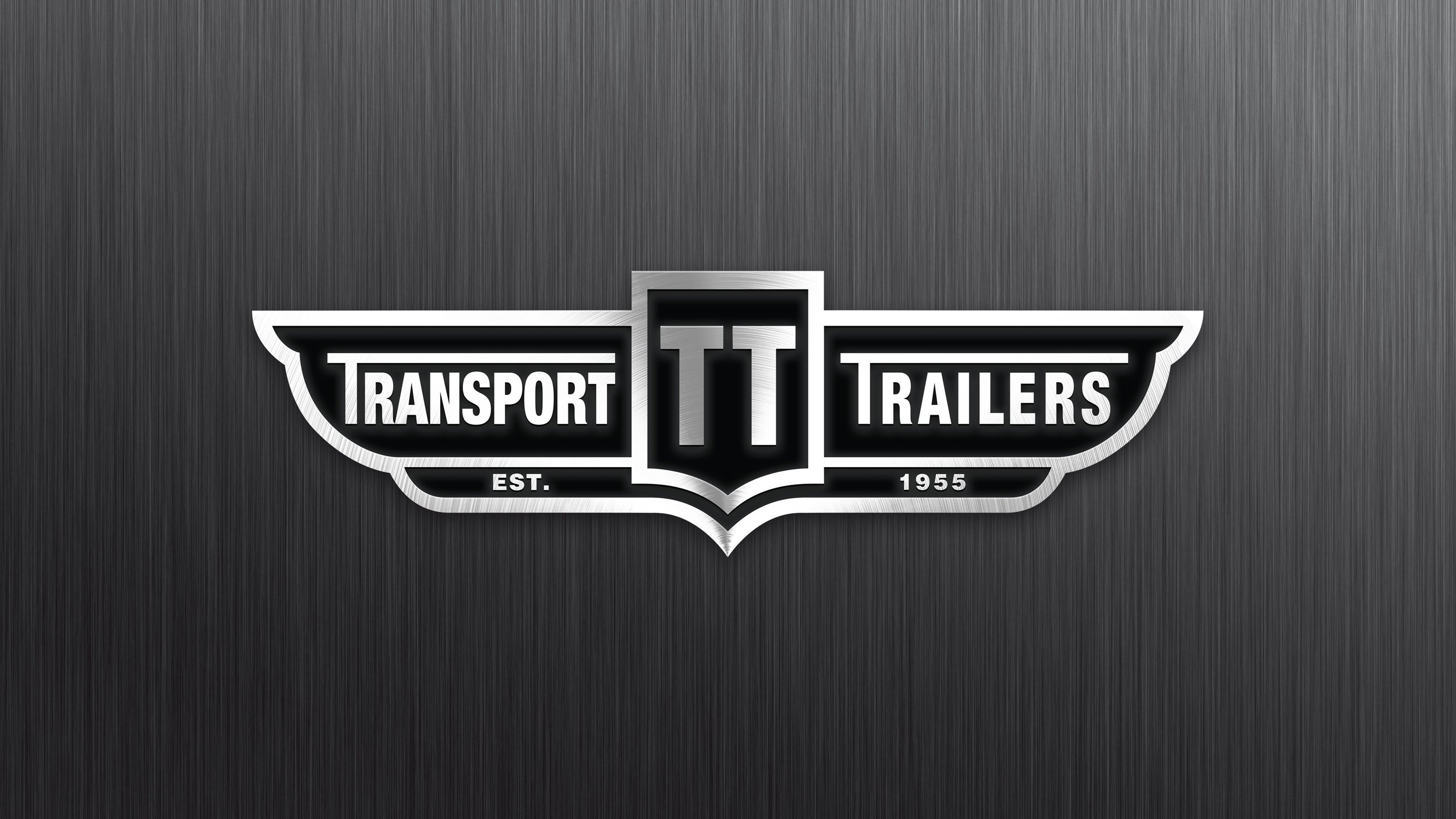
Final brand mark in 3D form:
At Tailwind we love projects like this. Our eyes are trained to focus on the smallest details of how letterforms and shapes are constructed, and this expertise pays off in surprising ways.
If your brand has a strong heritage and you don’t want it to change, but need to keep it current, talk to us to see how we can achieve this while taking great care to preserve your valuable brand mark.