New branding for Real Steel
Tailwind has been working with Real Steel since 2014. Their previous brand was designed in 2013 by another agency. After almost a decade, we had the pleasure of giving this industry-leading nationwide steel processing business a much-needed brand refresh.
The old logo had some problems:
Every variation included the tagline ‘works harder’ which caused the logo to appear more visually cluttered than necessary, especially as small sizes.
The wide/horizontal version of the logo was always the better-looking version, but was so wide and unsuitable for many uses.
The lettering was overly-technical in appearance and clunky, with a mixed-case that felt slightly staggered, inconsistent, and unsettled. Like uneven teeth.
The shield icon had some strange geometry and felt somewhat anaemic.
After almost a decade, the brand had lost its premium feel — a problem for a company that had continued to push forward in the industry with the highest quality materials and processes.
Here’s how we solved them:
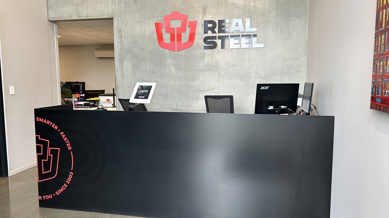
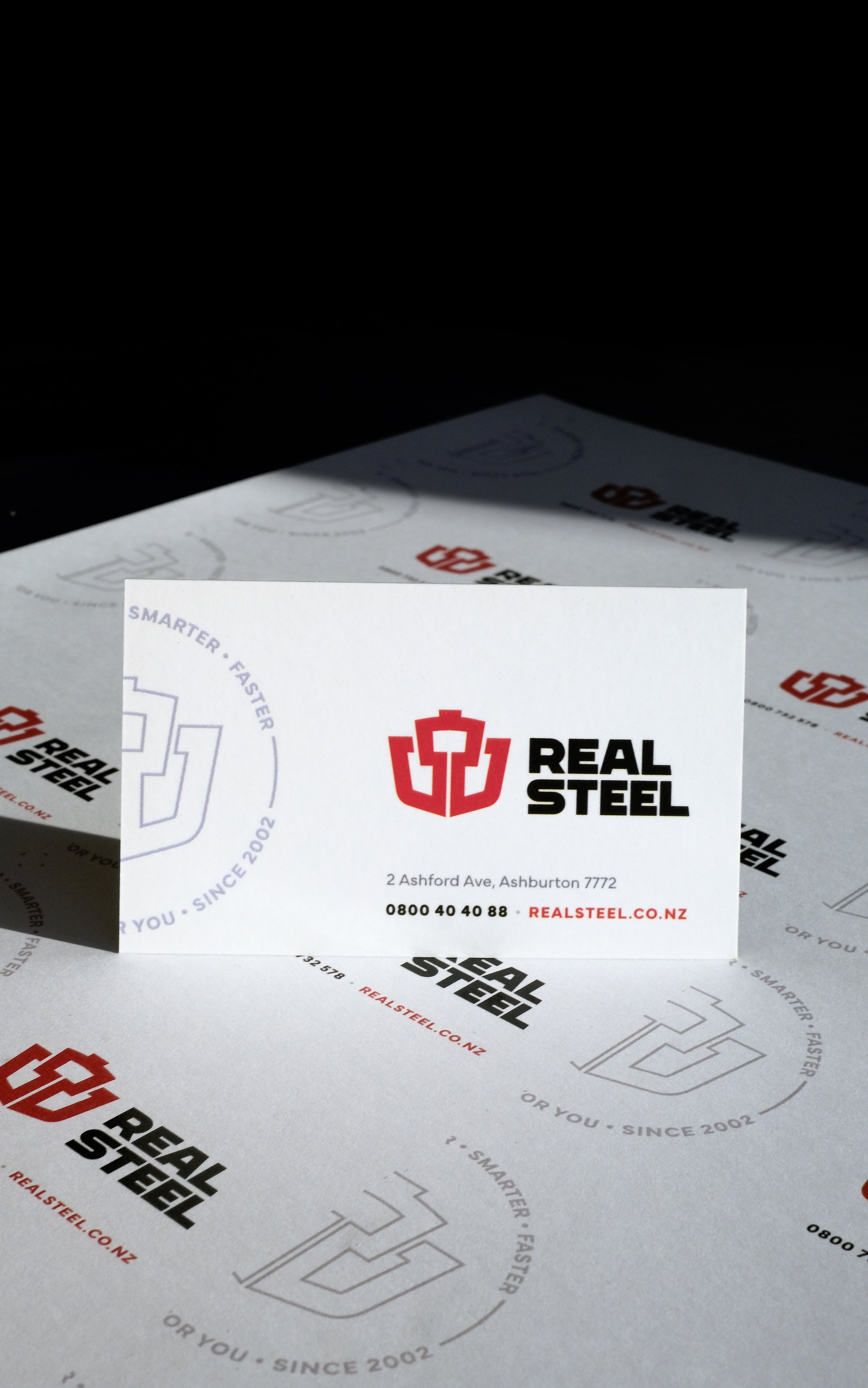
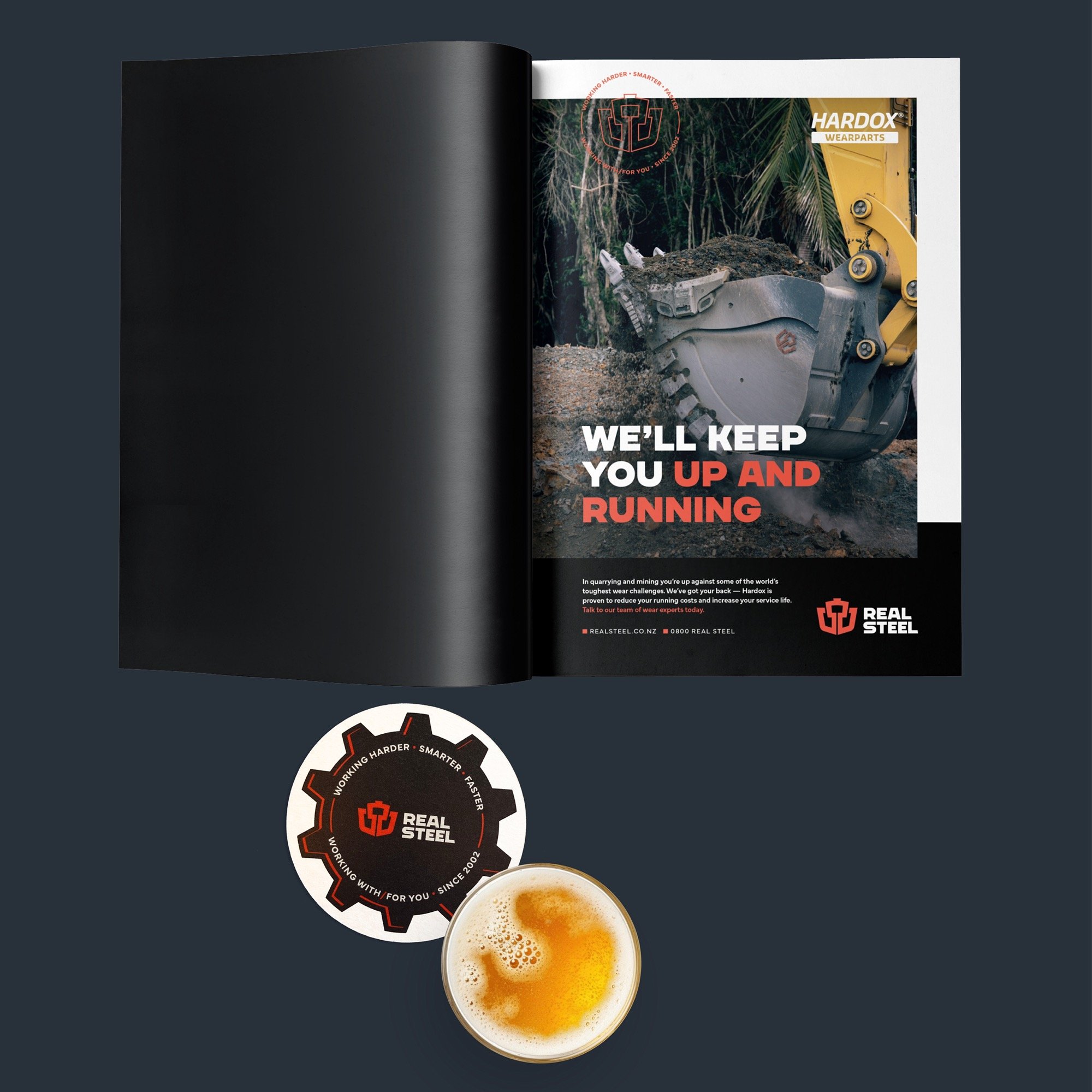
Removed the tagline for a tidier, punchier appearance. This was instead incorporated into a badge (that you’ll see later).
Set the name across two lines of text to reduce the overall width and improve its versatility.
All uppercase lettering for a stronger, more unified appearance.
The new lettering feels more settled and consistent. A few unique characters retain the sense of technicality.
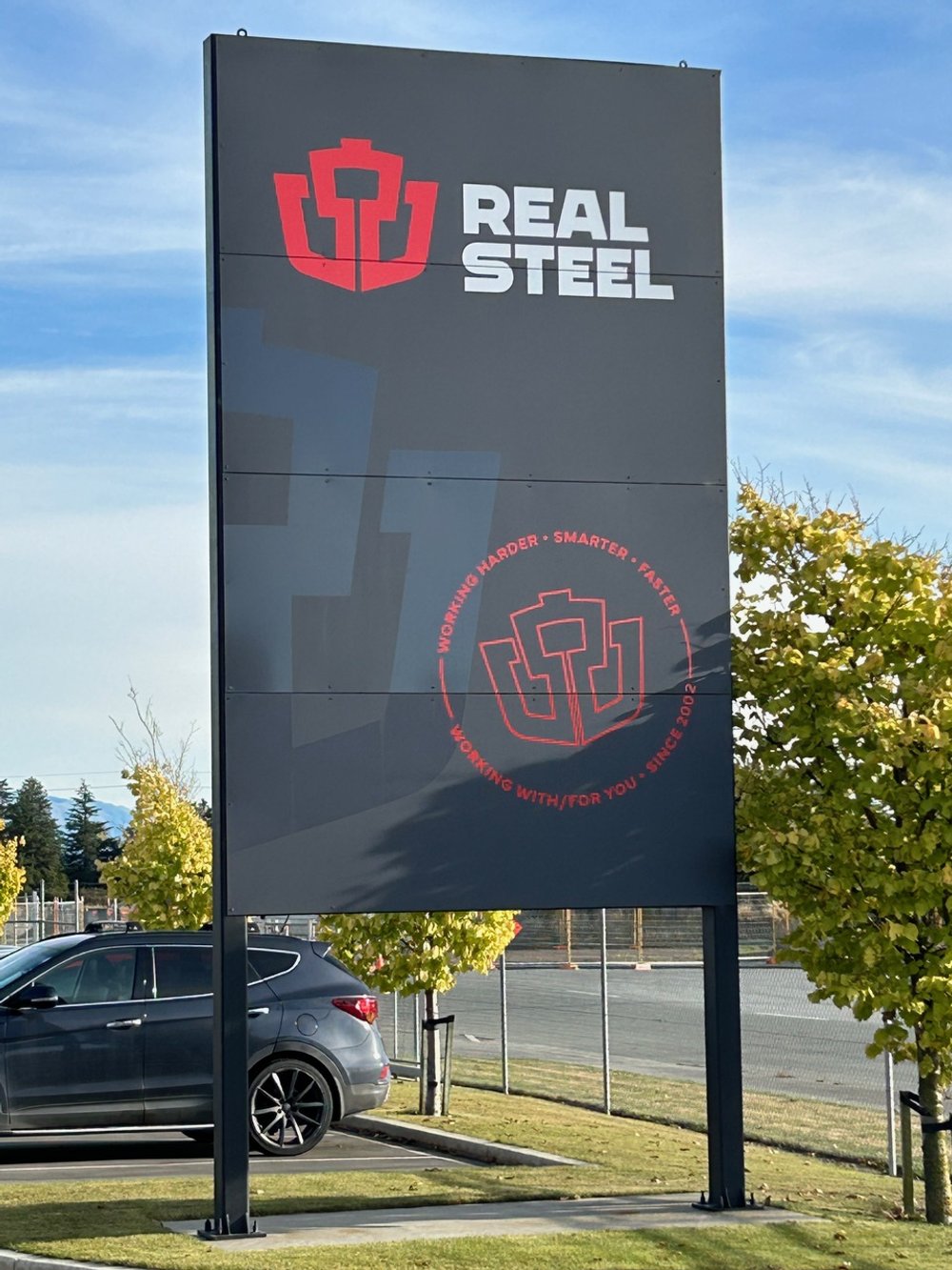
The shield was re-drawn in a heavier weight and with curved bottom corners to solve some of the strange feel of the old shield. The curves pair well with the R and S in the lettering, as well as appropriately appearing like formed steel plate (a Real Steel specialty).
In with the old, in with the new.
That’s not a typo! Believe it or not, a brand refresh needn’t require a business to throw out everything with the old brand. This case study is a great example of how a refreshed brand can fully modernise the presentation of a business, but do so without instantly obsoleting the old one.
Real Steel has had the new brand for 18 months and there are still some instances of the old logo around — and that is absolutely fine! Pragmatic brand rollouts are what we are all about.
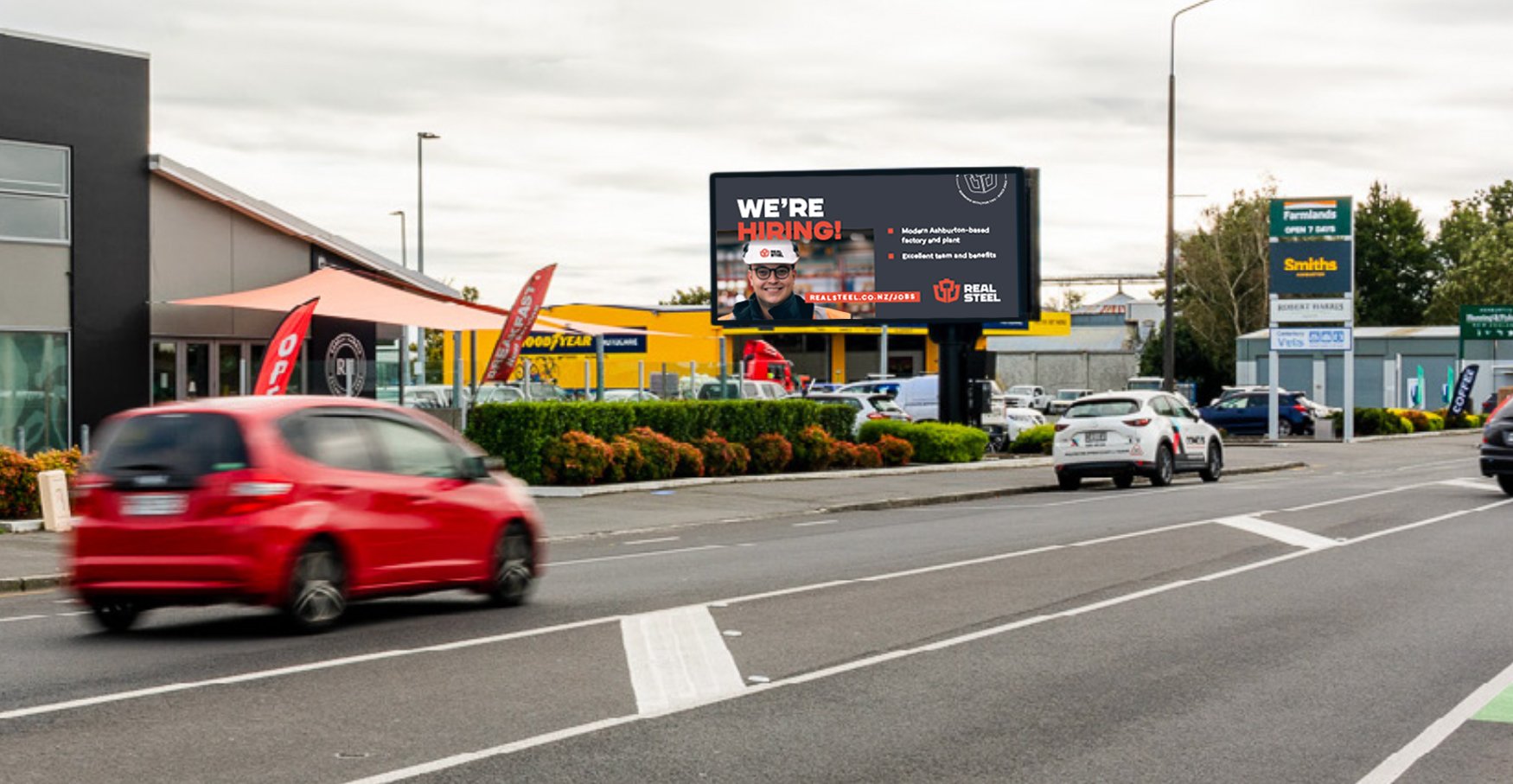
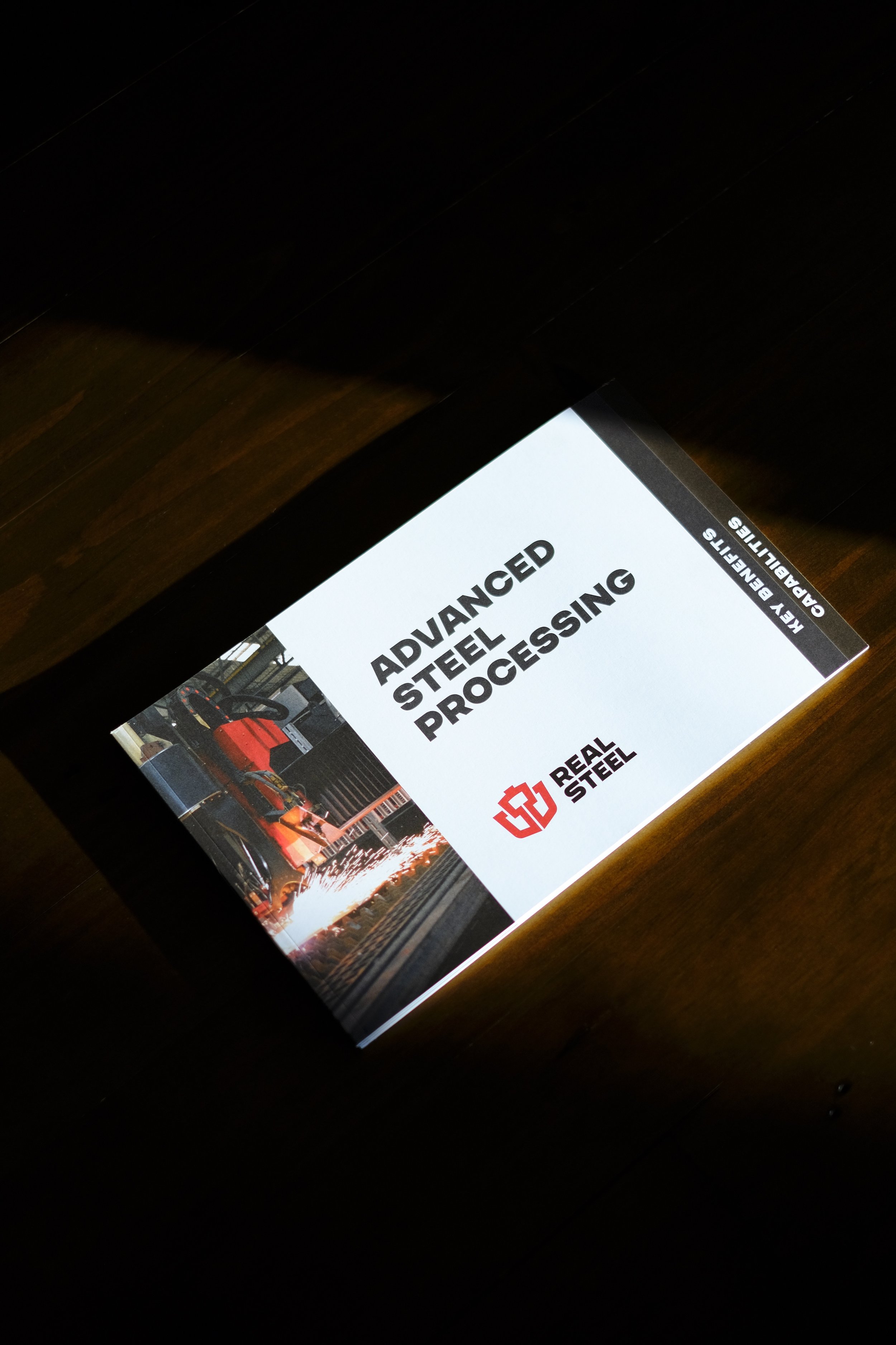
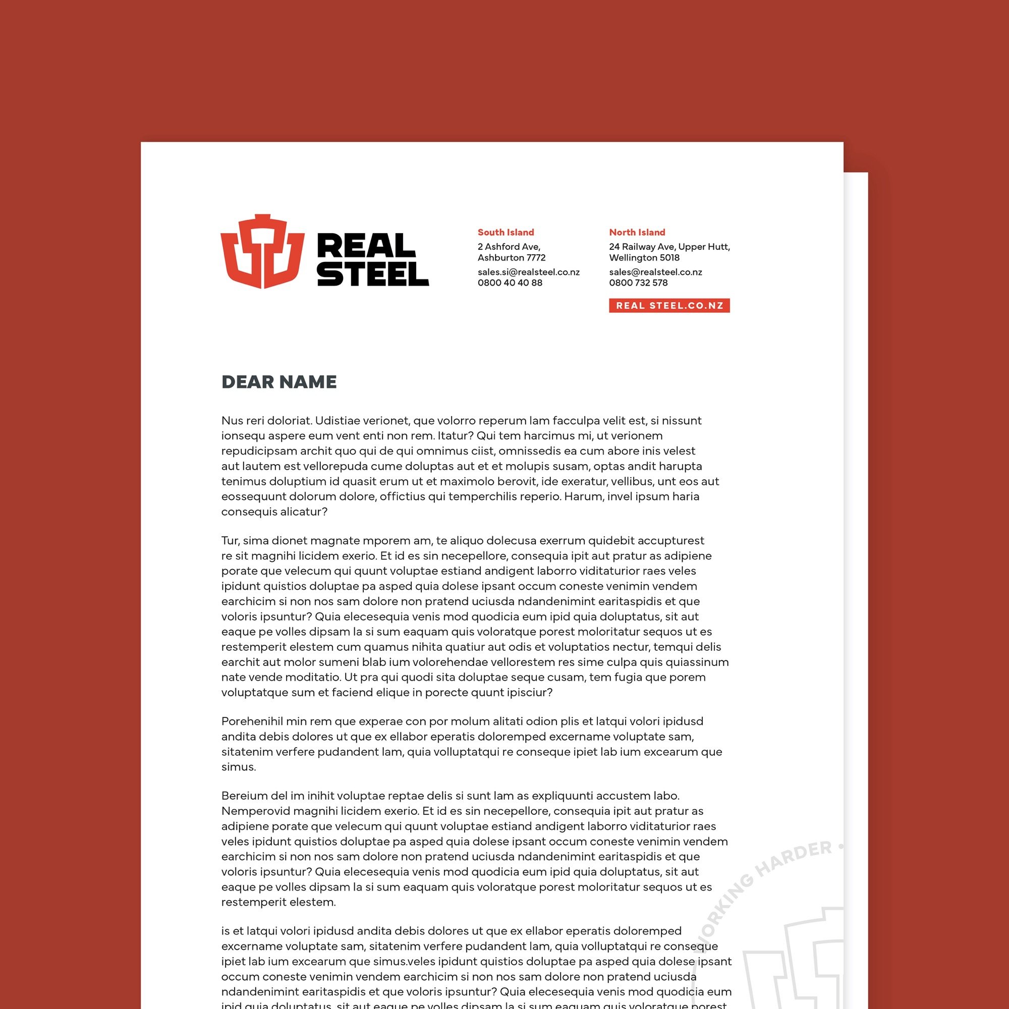
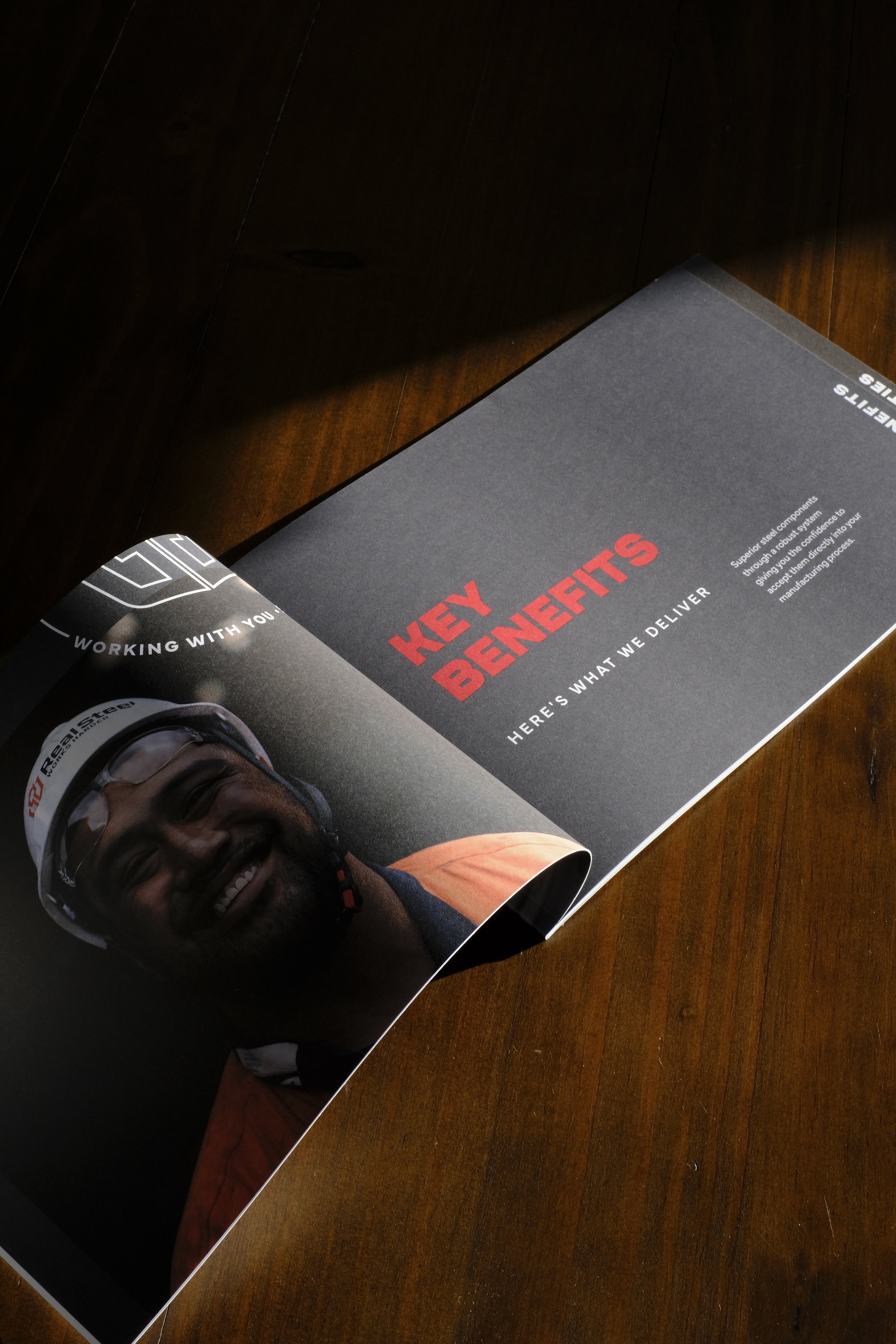
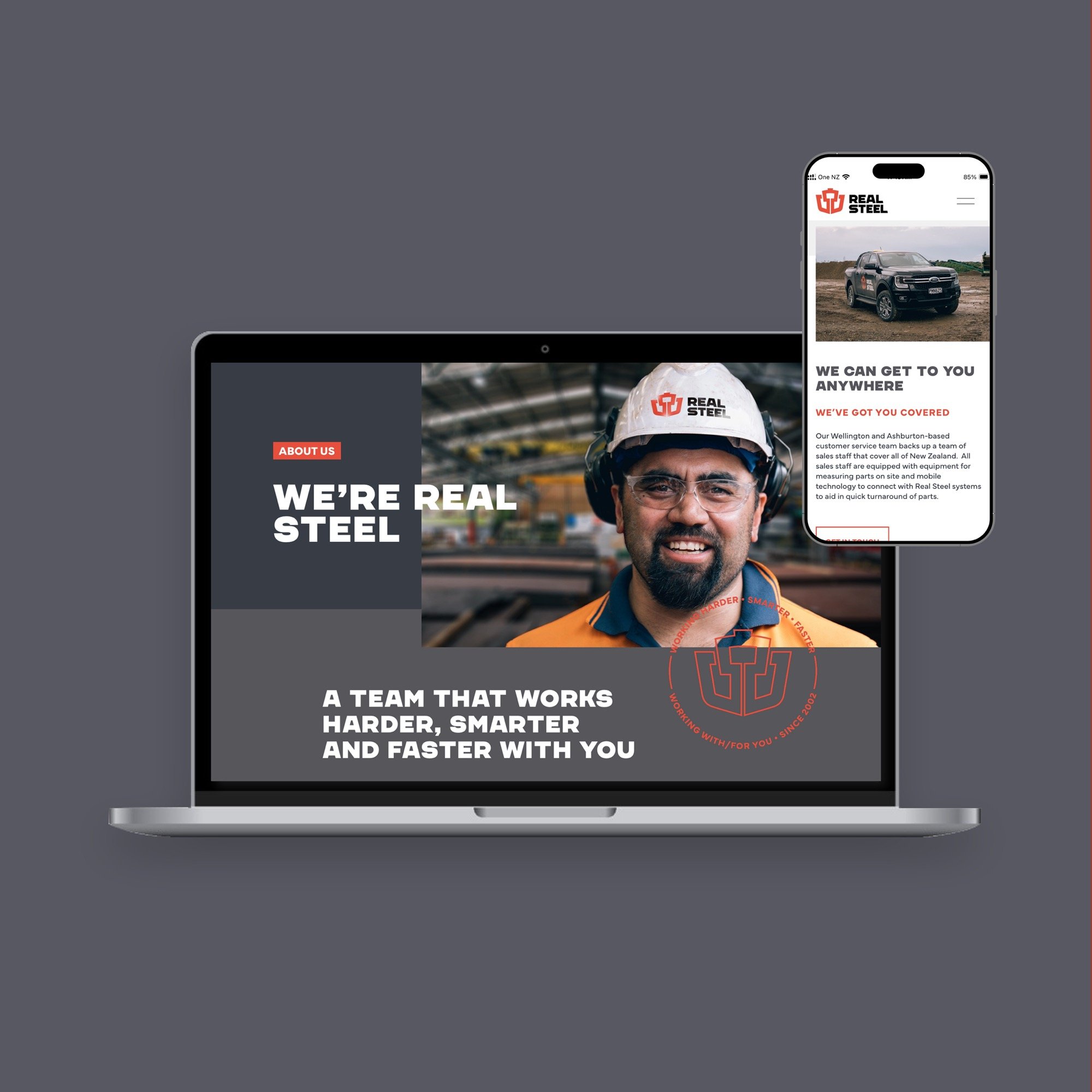
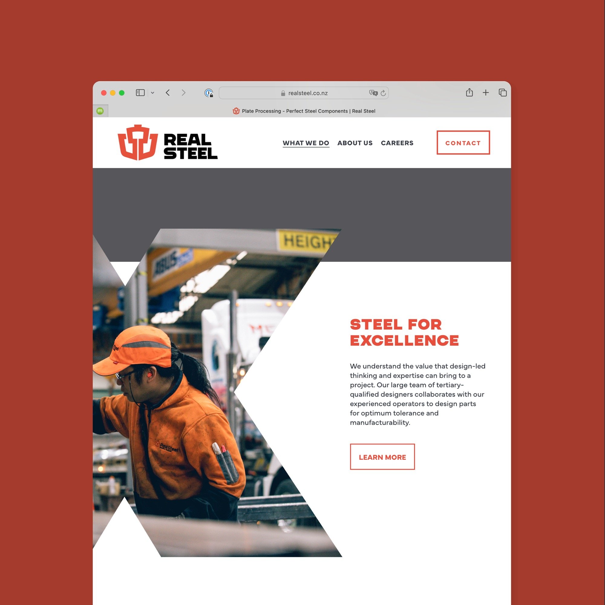
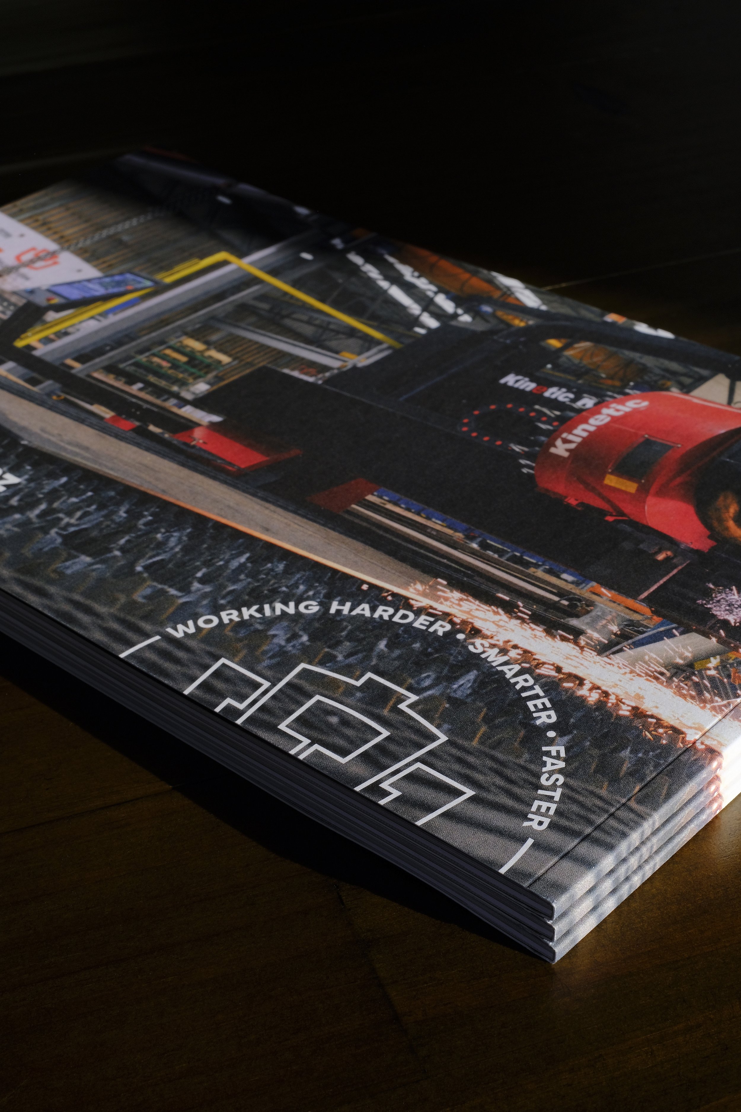
The full visual identity
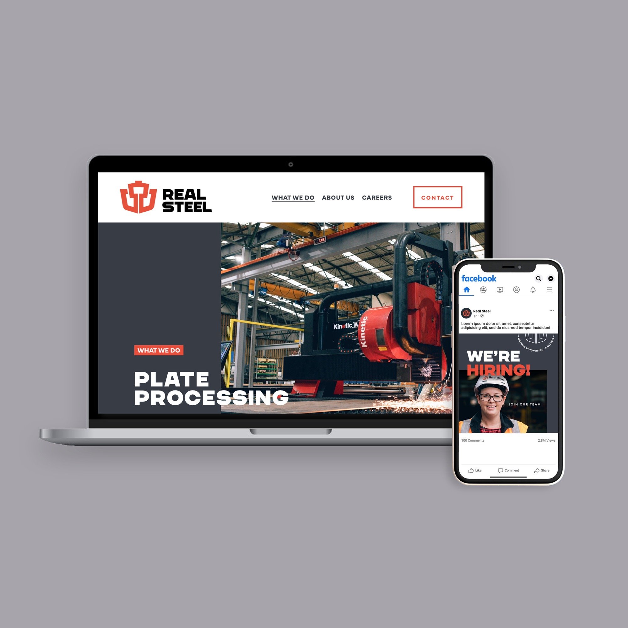
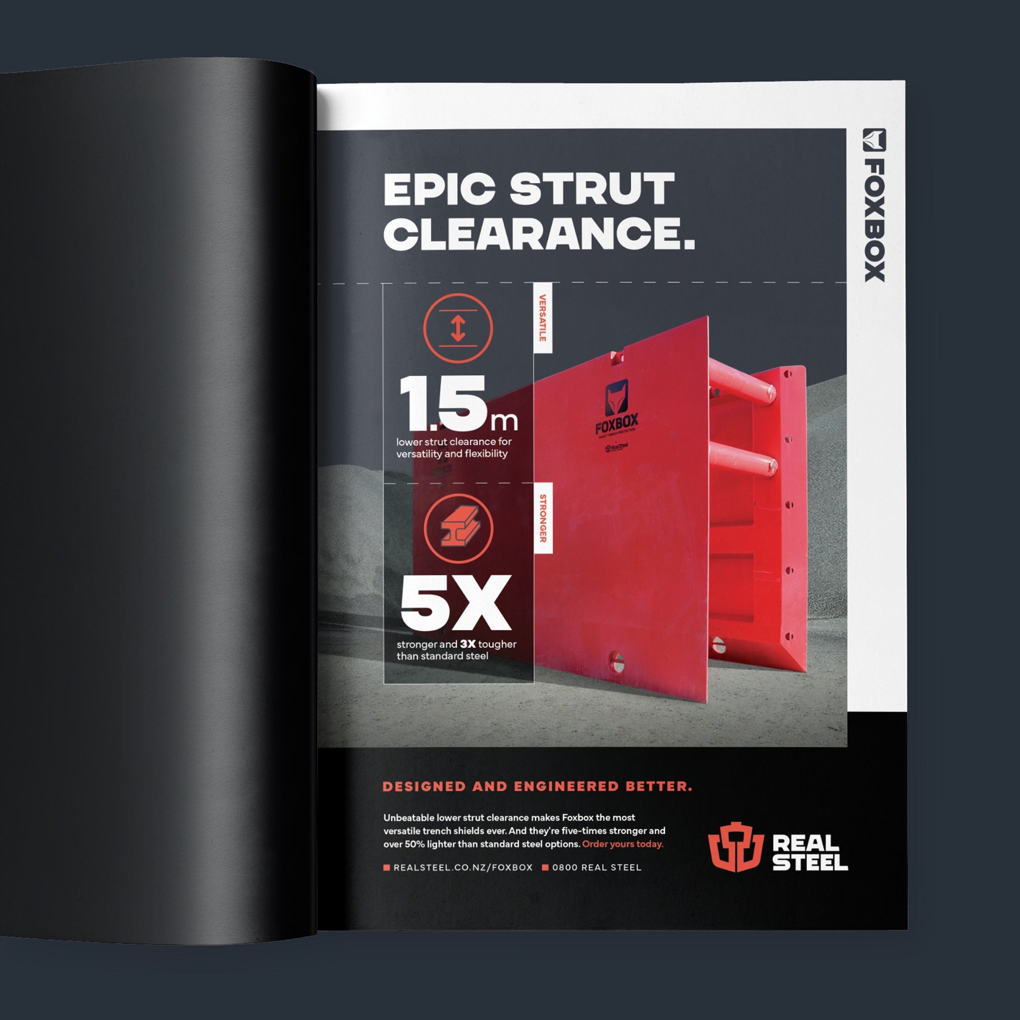
If you’ve followed Tailwind you already know that a brand is not just a logo — it’s your whole visual identity. Following the redesign of the logo, we set to work on establishing a wider brand identity. We revamped the company typography, expanded the colour palette, and introduced secondary brand elements and dynamic overlapping layouts. As a result, Real Steel’s appearance has dramatically improved and they now look as sharp as the steel they cut.
