Brand Design for Mana Mauri

Māori healer and occupational therapist Karen Below is our neighbour in Upper Hutt City Arcade. She moved into her luminous studio in 2023 and has been providing meaningful and effective services to her clients since.
We were honoured when she asked us to develop a brand for her new practice that would represent her mission and approach.
“Our mission at Mana Mauri is to help people to find themselves — their true selves. To find meaning, purpose and belonging. To find wholeness. Supporting you as you explore inward by understanding the forces around you. Guiding you on a journey of health and wellbeing. Revealing pathways to healing and restoration. Helping you weave your story with courage and hope. With understanding and love. Upholding you as you stand fast in your Mana and Mauri, stand firm between Papatūānuku and Ranginui.”
Our client requested that the new branding incorporate as many elements from this mission as possible, using a range of bright colours. It also needed to appeal to both Māori and Pākehā audiences.
In response to this, our logo is a modern representation of Toi Māori made up of a number of universal symbols that also hold significant meaning to Māori. The circle (continuity), heart (love), spiral (growth, movement, journey), and triangle (pointing both up and down) are all intertwined to create a clean yet beautifully complex form.

The form strongly whakapapas to maunga and to Papatūānuku and Ranginui. The elements all come together in the shape of a waka symbolising navigation. The symmetry and use of contrast reflect the duality of life: dark and light, seen and unseen. The takarangi (intertwining spirals) further represent Papatūānuku and Ranginui and their interconnectedness with creation (and us) at the centre.
The logo gives us a sense of being embraced and uplifted which are core aims of Mana Mauri. The many aspects of our lives are represented by the intertwining of the different symbols. Together they form a waka giving us a strong sense of moving onwards and upwards. Mana Mauri aim to guide our whole selves in a direction of health and wellbeing. The logo promises hope — that mana can be restored and mauri reawakened.


“Tailwind are a small business, like us, giving our community excellent branding. They accommodated my wairua infused self, matched me with a designer who captivated our brand so well and [integrated] the true whakapapa of what we stand for within the logo. They are a Pākehā owned business that embraced Mana Mauri and showed nothing but whakamana me aroha for us !”
—Karen Below, owner of Mana Mauri

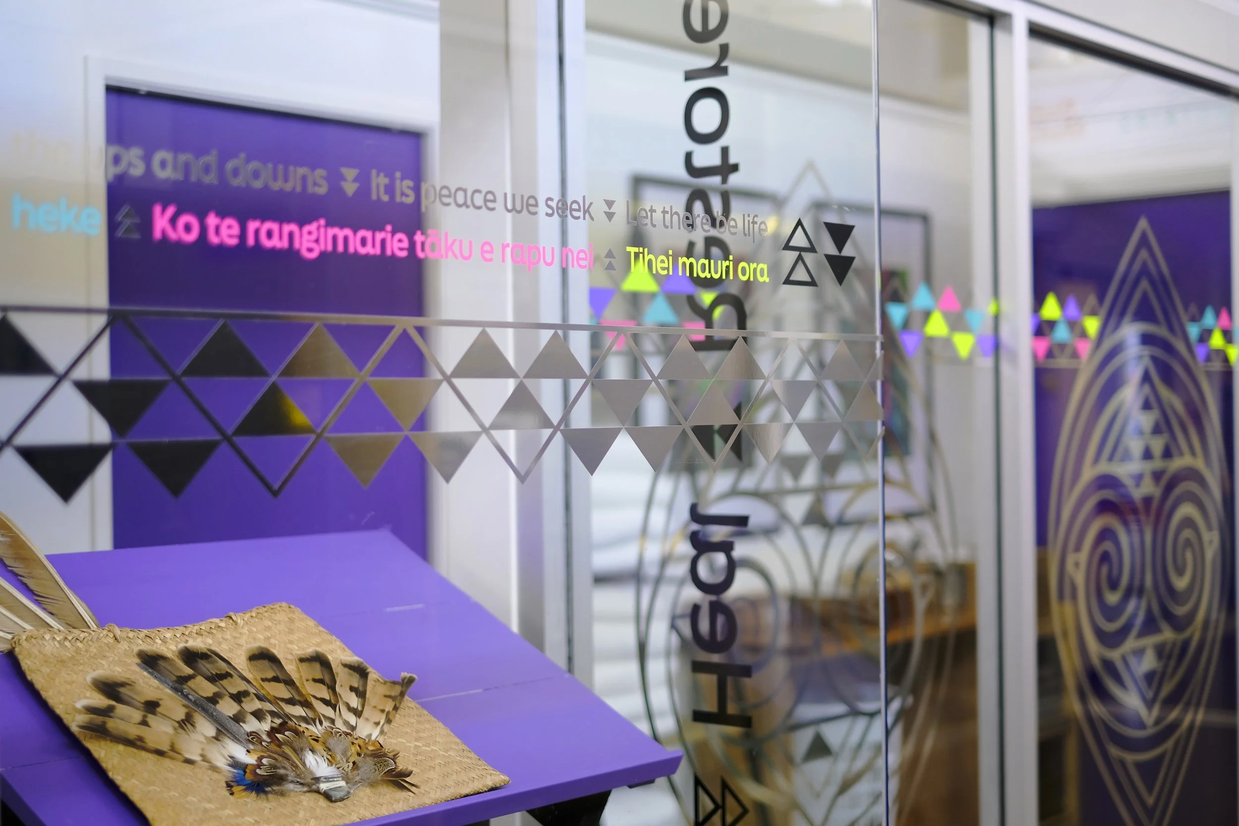
The storefront’s metallic finish was designed to reflect beautiful patterns through the City Arcade hallway.

Mana Mauri’s signage at the entrance of the City Arcade.