Branding and Marketing for Real Estate Development

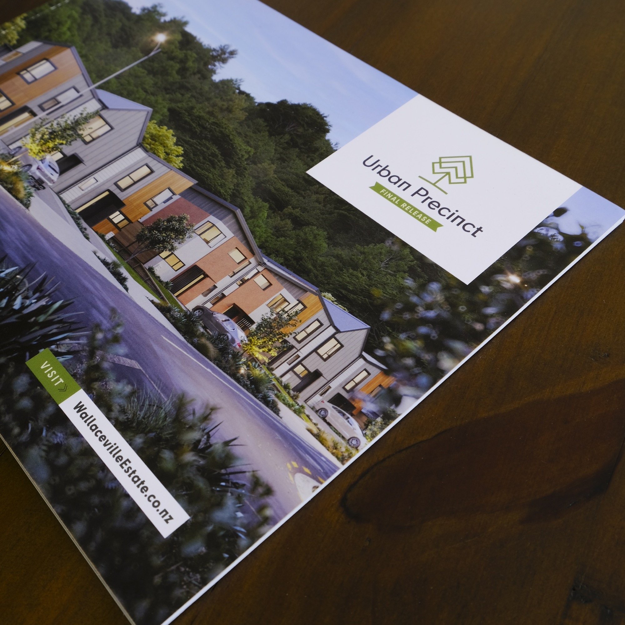
Our long-time clients at Gillies Group asked us to create a new brand and marketing collateral for their architectural high-density area of Wallaceville Estate, Urban Precinct.
The Urban Precinct identity includes a tree symbol that echoes its parent brand, Wallaceville Estate. This edition has an angular, modern look which reflects the development’s memorable architecture.
The marketing booklet carries through the brand’s angular feel with ‘anchored’ imagery, a tag system and geometrical ‘arrow’ devices echoing the logo.


We integrated subtle geometrical treatments throughout the booklet to reinforce the brand, for example in the site map's tree outlines.


Our 'metro-style' location tags (left) and double arrow device (right) both adopt the logo's signature angles.
